It is said that a picture is worth a thousand words. So, this week, I've decided to try and sum up the keys to the current market environment with a series of charts and graphs. I started out looking for five key charts. That quickly turned into ten. And before I knew it; I had a baker's dozen. And frankly, I'm sure I've skipped some key stuff. So many messages, so little time!
The areas I focused on include the technical picture of the market, the state of the current trade, market valuations, the Fed/monetary policy, and the #GrowthSlowing theme. So, without further ado, let's get to it.
The Technical Picture
Some analysts suggest we are currently experiencing a replay of last year's Q1 market action. We had a very nasty/scary pullback that was followed by a return to rally mode and eventually, new highs. However, one thing that was missing from last year's rebound were indications that there was some "oomph" behind the move. And as most analysts know, it is that "oomph" which usually accompanies a fresh leg of a major move.
As it turned out, the lack of "oomph" to last year's rally turned out to be a precursor of bad things to follow. Sometimes, it does indeed pay to read the tea leaves in this game.
The good news is that this time is different. This time around, there are an abundance of "breadth thrust" indicators that have flashed buy signals, which is a sign that there indeed is some "oomph" behind the move. Below the latest signal to trigger - the percentage of stocks over their 50-day moving averages.
Breadth Thrust Buy Signal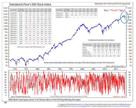
View Larger Chart Online
Source: Ned Davis Research
History shows that when 90% of stocks are above their 50-day ma's, the trend tends to favor the bulls for a decent length of time. In fact, I've often referred to such triggers as an "all clear" signal. You see, according to data from Ned Davis Research, on average, the S&P 500 moves higher at an above average rate in the ensuing 3-, 6-, and 12-month time frames after breadth thrust buy signals.
One caveat with the "thrust" indicators is that in the era of decimalization, the preponderance of ETFs, and high-speed trading, these signals have been much easier to come buy. Therefore, we need to look around for other indicators to confirm that the bulls are indeed large and in charge. As Ned Davis himself likes to say about these signals, "trust but verify." While history suggests one can "trust the thrusts," Ned says it is important to "verify" the validity of the signal with other indicators/models.
Along those lines, one of the things we like to see is a positive "technical divergence." In short, we're looking for indicators to "diverge" from the current picture being shown on the charts. In this case, we see that the Advance/Decline line of an all-cap equity universe has moved to all-time highs.
Positive Technical Divergence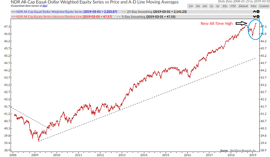
View Larger Chart Online
Source: Ned Davis Research
And since the major indices are not (yet?) at all-time highs, this represents a divergence - in a good way.
Another age-old confirmation factor used to determine whether or not a move is "real" involves volume. Granted, a massive percentage of the volume on the various exchanges these days is driven by machines. As such, simple measures of volume have become distorted over the years.
However, one concept I still like is what's called "demand volume" versus "supply volume." This is where one smooths out the total advancing volume and then compares it to declining volume. The key is that when "demand volume" is above "supply volume" solid stock market advances tend to ensue.
Volume Confirming Rally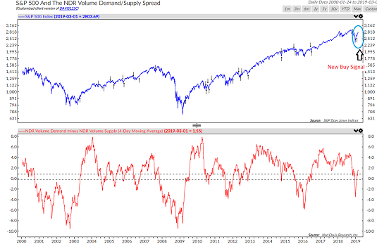
View Larger Chart Online
Source: Ned Davis Research
As you might have suspected from the lead-in, a fresh buy signal has just been given by this indicator. And while not all the signals are perfect, the big moves in the market do tend to coincide with a positive signal from volume. So, from my seat, the volume relationship appears to be confirming the bulls' position.
What Do The Cycles Say?
Another old saw in the market is that "history never repeats exactly, but it often rhymes." This is the idea behind NDR's "Cycle Composite," which is a mash-up of the historical one-year, four-year Presidential, and 10-Year Decennial Cycles going back to the early 1900's. The key here is to recognize that the market often travels in familiar seasonal patterns and therefore, the historical cycles can be used to project what the coming year might look like.
As I've stated a time or two over the years, when the cycle composite is "on" it tends to be a good guide in terms of what might come next in Ms. Market's game. As in "scary" good. But there are also times when the composite is off the rails and stocks simply go their own way.
Below is a chart comparing the current market (red dashed line) to the projection of the cycle composite (solid blue line).
Historical Cycles Suggest More Upside Ahead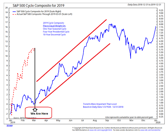
View Larger Chart Online
Source: Ned Davis Research
As you can see, the cycle composite suggests that stocks are projected to rally into the traditional "fall swoon" period. With some bumps along the way, of course. Thus, the bulls will argue there is more upside ahead.
However, one caveat I'll toss in is that the current rally may have already "borrowed" some of the expected rally. In other words, some of the year's projected gains may have already been "pulled forward" into the first two months of the year.
Next up is a picture of the current technical condition. There are two takeaways here. First, "V is for Victory."
V is for "Victory" And Important Resistance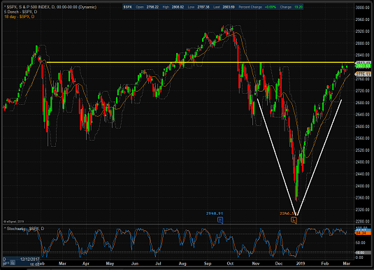
View Larger Chart
While V-Bottoms (a bottom that occurs without a period of testing and/or basing) are very rare, it certainly looks like we can trace out a perfect "V" on the chart of the S&P 500. This is likely due to the idea that December's waterfall decline was based on fears which were "fixed" or reversed quickly.
The second key takeaway from the current chart of the S&P is the yellow horizontal line I've drawn. This line represents a key resistance zone. The thinking here is simple. If the bulls can move through this important line-in-the-sand (preferably with some "oomph" behind the move), then new highs are the next logical step. But if the bears make a stand and the resistance holds, then a pullback to "test" the move would be the most likely outcome in the near-term. We shall see.
Next, it is worth noting that during the current joyride to the upside, stocks have become overbought in the process. As in VERY overbought. See the chart of the 40-period RSI below as Exhibit A in this argument. Yep, that's a high reading.
An Overbought Condition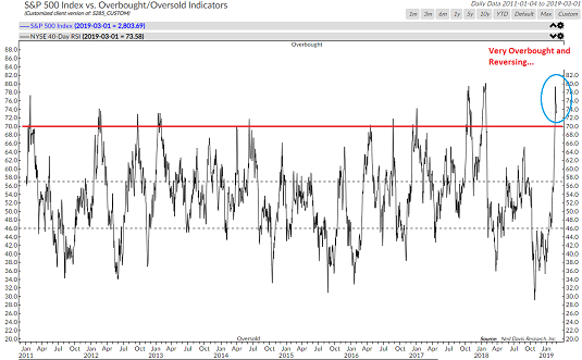
View Larger Chart Online
Source: Ned Davis Research
The key point here is that when stocks become overbought the table is effectively "set" for the bears to make a counter-trend attack. Remember, stocks rarely move in a straight line for any length of time. And since the current move has now retraced the entirety of December's debacle, one can argue that it's time to pause and assess what the future holds for the economy and corporate earnings growth.
One of the "tells" we'll be watching is the anticipated volatility of the market. While this is a complex subject, I like to keep things simple. So, my view is that when the VIX is elevated, it means that risk is also high. However, when the VIX stays low in a tight range, the market tends to chug higher without a lot of scary downside action.
A New Volatility Range?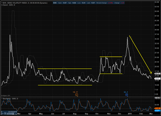
View Larger Chart Online
So, from my seat, I'll be watching to see if the VIX settles into a new, lower range here or reverses higher. Stay tuned.
The Subject of Valuations
One of the positives to come out of the October - December correction was some improvement in the valuation metrics. Recall that one of the complaints about the market was that valuations were at nose-bleed levels, which suggested that risk was high. But the combination of a quick -19.8% pullback and last year's earnings growth resulted in many valuation measures moving out of the overvalued zone.
Unfortunately, the "correction of the correction" has returned the valuation metric below back to the overvalued zone.
A Return To Overvalued Territory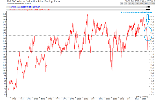
View Larger Chart Online
Source: Ned Davis Research
While this in and of itself is NOT a reason to sell stocks, it is a reminder that the sky is definitely not the limit here.
The Fed
Perhaps the primary reason for Ms. Market's sudden mood swing coming into 2019 was the complete about-face by Jay Powell and his merry band of central bankers. In short, the Fed caved to market/political pressure. And of course, stocks loved it as the Fed's changing tune meant the "Fed Put" was back. Thus, traders were free to "buy 'em" without much fear of seeing big losses in the stock market.
Another reason for the rally in stocks is the idea of investors breathing a collective sigh of relief over the Fed's decision to pause their rate hike campaign. Below is a chart showing the history of Fed Rate-Hike Cycles.
Some History on Rate Hike Cycles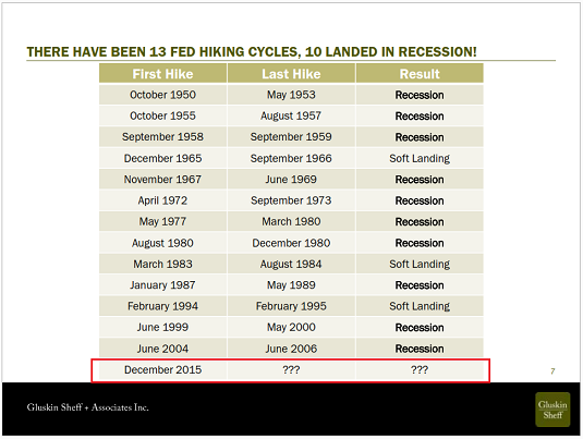
View Larger Chart Online
Source: Gluskin Sheff & Assoc.
As the chart illustrates, the economy wound up in recession 10 times out of the prior 13 rate-hike cycles. Not exactly a desired result, nor a record to be proud of.
So, the simple fact is that Powell appears to have moved to a "patient" stance. And at this stage of the game, this gives investors reason to believe the Fed will be able to indeed "thread the needle" here.
#GrowthSlowing is Real
So... Stocks tanked on fears of recession and a policy mistake. But both fears were quickly reversed as Powell caved and the thinking is that a trade deal with "fix" the slowing growth problem. Again, we shall see.
There are a couple points I'd like to make on this subject. First, we need to recognize that the slowdown is real and it started long before the "trade spat" with China began.
Second, the U.S. is unlikely to remain immune to the slowdown concept. Exhibit A in my argument is NDR's scorecard of expected economic growth below.
#GlobalGrowthSlowing
Source: Ned Davis Research
Note that with the exception of India, the other major economies of the world are expected to slow. To be sure, this is not an indication of impending doom, but it certainly does raise the risk bar a bit. Put another way, it is important to realize that stocks can only go so far if growth is slowing.
Next up is a chart that certainly got my attention - A Recession Warning signal from ECRI's U.S. Weekly Leading Index.
A Recession Warning Signal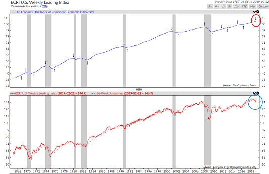
View Larger Chart Online
Source: Ned Davis Research
Yes, it is true that this index has bonked recently. The indicator has predicted recessions twice since the crisis ended and neither time the economy succumbed. However, prior to that point, the indicator had correctly "called" the last seven recessions.
So, while it would be easy to dismiss this as a "broken" indicator, six of the last eight signals were correct. And in my book, this warrants at least a small degree of attention.
While we're on the topic, my guess is you've seen the various models relating to the probability of the U.S. economy entering a recession. Below is one of NDR's versions, which uses the Yield Curve as a predictor.
Probabilities of Recession Rising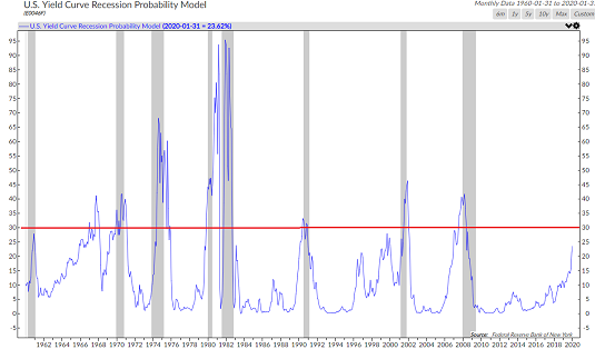
View Larger Chart Online
Source: Ned Davis Research
The positives here are (1) the yield curve has NOT inverted and (2) the model is not at a level that has led to recessions.
However, before we skip merrily down the road in perpetuity and just keep buying the stock market blindly, it might be worth noting that this model is currently at the highest level since the crisis - and the last recession.
And finally, there is the subject of earnings. I've used the chart below several times recently to illustrate the idea that analysts have been busy cutting estimates for S&P 500 EPS growth in 2019.
Have Estimates Come Down Enough?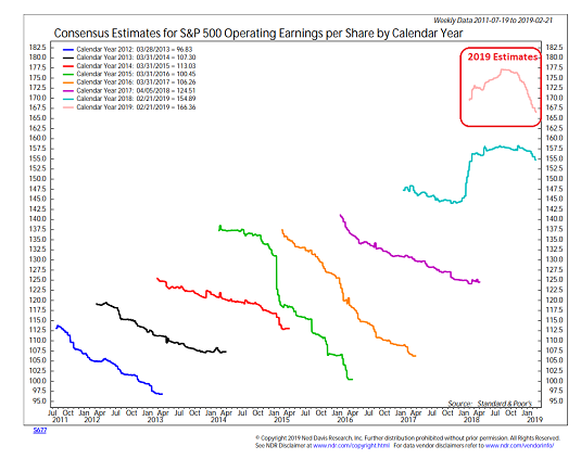
View Larger Chart Online
Source: Ned Davis Research
The key here is that estimates for EPS growth this year have come down from the 14.3% level seen last fall to around 7.4% currently. This is a good thing as it lowers the bar for the upcoming earnings seasons.
However, the question is, have estimates have come down "enough?" Remember, Wall Street is talking about negative EPS growth in Q1. This means that earnings will have to bounce back pretty hard in order to reach the 7% zone for the calendar year.
So... If the trade deal does indeed "fix" the #GrowthSlowing issue, then stocks have a fair amount of upside from here and 2019 could wind up being a strong year. If not, then the market may spend some time "backing and filling" as we wait for clarity on the earnings picture.
The Takeaway
The stock market has run a long way in a short period of time as the S&P has basically corrected the December swoon. The rebound has placed the index back to where it was last summer and in early 2018, leaving investors to grapple with what to "discount" going forward.
For me, the question is if the market will discount brighter days and higher growth ahead or move into wait-and-see mode.
Thought For The Day:
Wise men are not always silent, but they know when to be --Unknown
Wishing you green screens and all the best for a great day,

David D. Moenning
Founder, Chief Investment Officer
Heritage Capital Research
HCR Focuses on a Risk-Managed Approach to Investing
What Risk Management Can and Cannot Do
HCR Awarded Top Honors in 2018 NAAIM Shark Tank Portfolio Strategy Competition
Each year, NAAIM (National Association of Active Investment Managers) hosts a competition to identify the best actively managed investment strategies. In April, HCR's Dave Moenning took home first place for his flagship risk management strategy.
<hr>Disclosures
At the time of publication, Mr. Moenning held long positions in the following securities mentioned: none - Note that positions may change at any time.
The opinions and forecasts expressed herein are those of Mr. David Moenning and may not actually come to pass. Mr. Moenning's opinions and viewpoints regarding the future of the markets should not be construed as recommendations. The analysis and information in this report is for informational purposes only. No part of the material presented in this report is intended as an investment recommendation or investment advice. Neither the information nor any opinion expressed constitutes a solicitation to purchase or sell securities or any investment program.
Any investment decisions must in all cases be made by the reader or by his or her investment adviser. Do NOT ever purchase any security without doing sufficient research. There is no guarantee that the investment objectives outlined will actually come to pass. All opinions expressed herein are subject to change without notice. Neither the editor, employees, nor any of their affiliates shall have any liability for any loss sustained by anyone who has relied on the information provided.
Mr. Moenning may at times have positions in the securities referred to and may make purchases or sales of these securities while publications are in circulation. Positions may change at any time.
The analysis provided is based on both technical and fundamental research and is provided "as is" without warranty of any kind, either expressed or implied. Although the information contained is derived from sources which are believed to be reliable, they cannot be guaranteed.
Investments in equities carry an inherent element of risk including the potential for significant loss of principal. Past performance is not an indication of future results.
Recent free content from FrontRange Trading Co.
-
 Is The Bull Argument Too Easy These Days?
— 8/31/20
-
 What Do The Cycles Say About 2020?
— 1/21/20
-
 Modeling 2020 Expectations (Just For Fun)
— 1/13/20
-
 Tips From Real-World Wendy Rhoades
— 5/06/19
-
 The Best Recession Ever!
— 4/29/19


